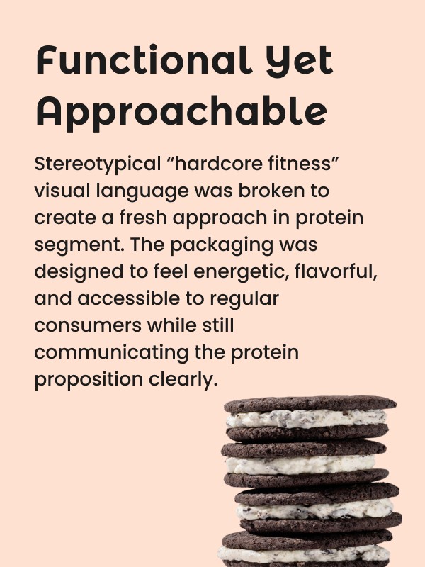
PACKAGING STRATEGY & CONCEPTS
The packaging strategy focused on creating a strong and scalable pack architecture that positioned “Pro-Oats” as the hero rather than leading with flavour alone. This helped establish the category as a recognisable product range while reinforcing its protein-first proposition. Key nutritional highlights, protein content, and product benefits were prominently showcased on the front of pack to ensure quick consumer understanding and stronger shelf communication.
PACKAGING DESIGN
The packaging design combined vibrant colours, realistic ingredient compositions, and dynamic food styling to create a modern and engaging visual system for the Pro-Oats category. Each variant was carefully crafted to balance nutrition cues with taste appeal, ensuring the range stood out within both health-food and mainstream snacking spaces. The overall design language felt contemporary, flavour-forward, and scalable across future product extensions.
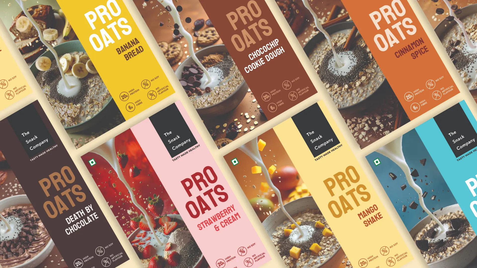
GRAPHIC DESIGN
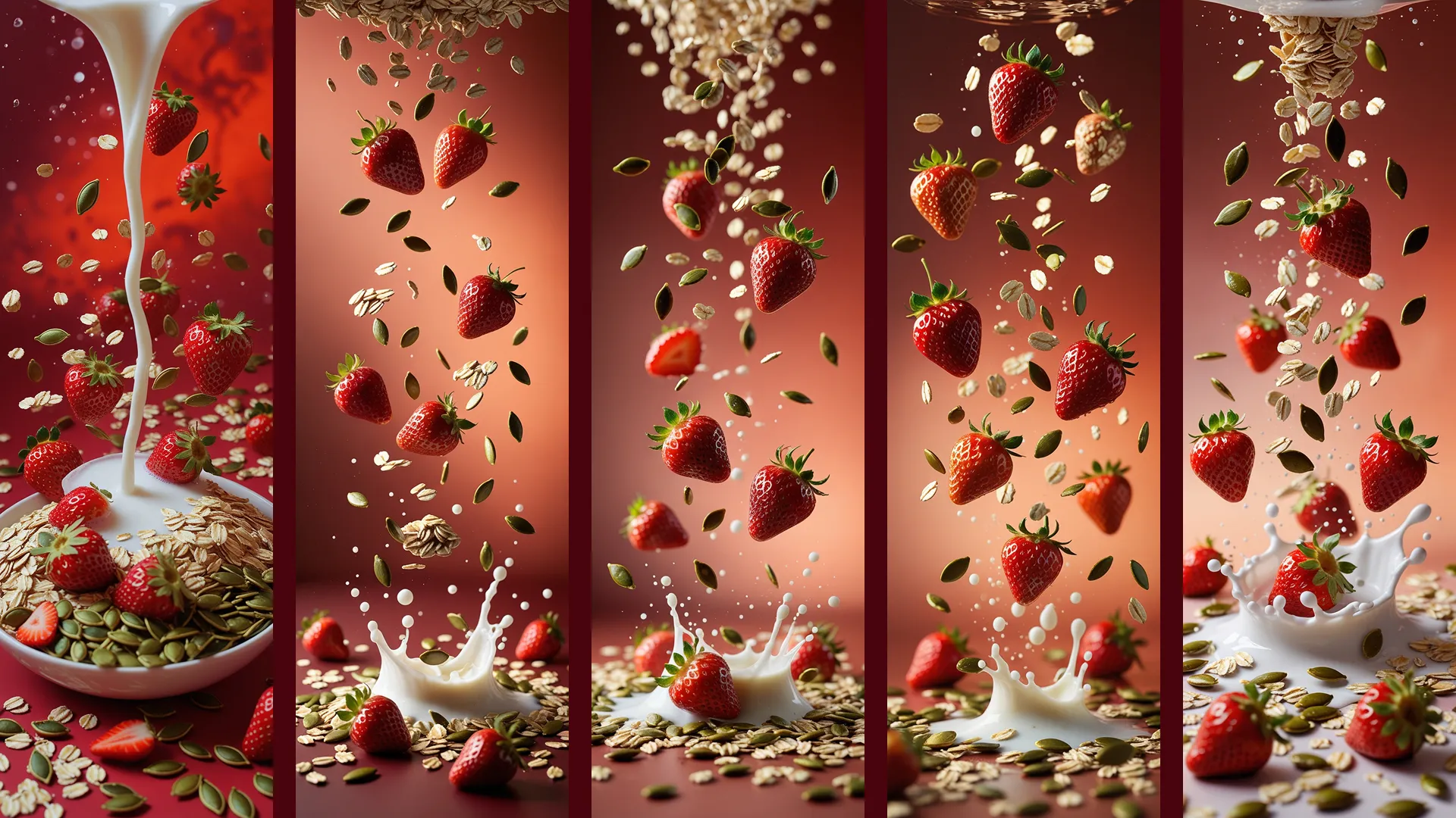
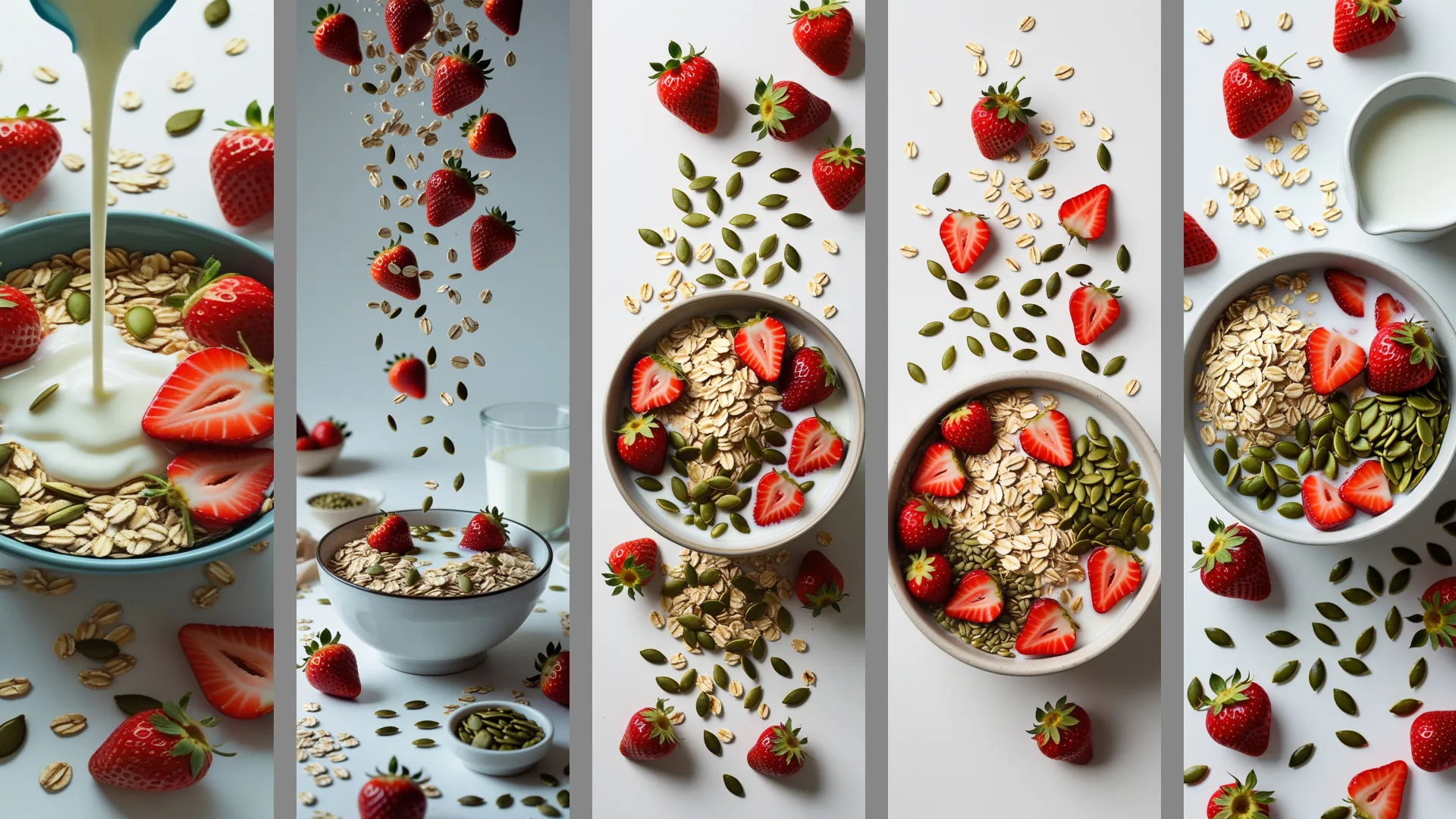
The graphic elements for each variant were meticulously designed to create depth, movement, and realism across the packaging. Real ingredients were thoughtfully composed alongside rhythmic milk pours flowing into the oat bowls, creating a sense of freshness and indulgence. Different angles, background colours, ingredient types, and quantities were carefully explored to create the most rich and natural-looking food visuals. Every visual was painstakingly crafted to enhance appetite appeal while making each flavour feel distinct, vibrant, and instantly recognisable on shelf.